To coincide with the reveals of the US and UK covers of Ingrid Robeyns’s Limitarianism: The Case Against Extreme Wealth, US cover designer Pablo Delcan and UK cover designer Jamie Keenan had a conversation via email about their design processes, the experience of working with small versus large presses, and how they unknowingly worked with the same idea to create two different but complementary covers for the two editions of this book.
Jamie Keenan: I was hoping [the US cover] was really terrible (ha ha!)—but then I found out it’s by Pablo, so I’m assuming it’s amazing. Pablo, how did you start designing the cover and how do you start designing covers in general?
Pablo Delcan: Excited to be talking to you about this stuff, Jamie. I remember doing a mechanical for a cover you designed back in 2013; I was working at Pantheon Books, and it had this beautiful lettering on it that was foil stamped with different colors. I can’t remember the title or the author but I remember how special the book felt as an object.
How I start designing covers has changed over time. I’m now starting to have fun making them. For this book cover in particular, the subtitle did so much of the heavy lifting, it was about finding something that would speak to it or complement it visually. I just started throwing things together very quickly and roughly, mostly focusing on ideas and compositions—it’s a quantity over quality thing. That’s probably the thing that has changed most about my process over time: before, I wanted everything to be good right away, and now I just trust that it’s about finding the seed of an idea and helping it find its potential.
This process works well when there is someone at the other end of it that can take in the sketches for what they are and help find the potential to push something forward. In this case the art director was Rodrigo Corral and his team, who are brilliant, and did just that.
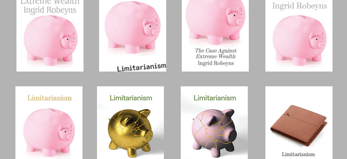
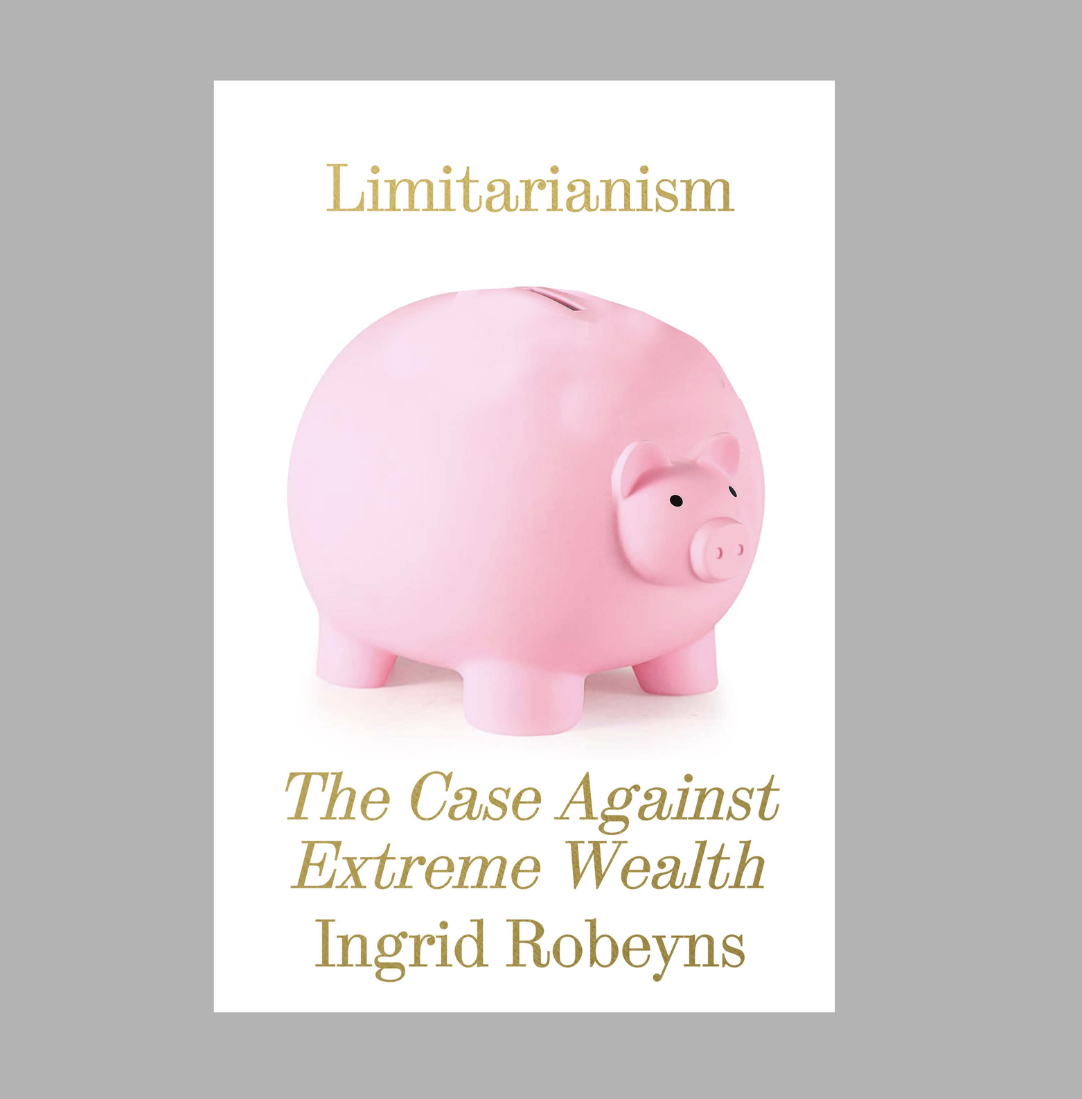
The piggy was the first idea that came to mind after reading the subtitle. I thought it’d be funny if the cover was a shiny bloated piggy bank. I’ll share it here:
Looks like we both found a different way of exaggerating the idea of economic swelling. What were some of the other ideas you had for it? What was your process? Also, in general, what do you think makes a good book cover?
JK: Was that Pantheon book called The Drunkard’s Walk?
I’m excited to be talking to you too and I love how it turns out our covers have the same underlying idea of taking something that represents money in a simple, everyday way and then bloating it to a ludicrous level. And my way of working is weirdly similar, too.
My favorite story is about a ceramics professor who splits his students in their final year into two groups and tells one half to produce just one piece of work (and make it amazing!) and the other half that their final mark will be based solely on the weight of their work. The first group are mostly petrified and come up with next to nothing and the second set (who are mass producing any old crap, as long as it’s heavy) happen to produce some amazing work along the way. I start by producing a lot of things, too, and even though they’re mostly useless, there’ll be a few things here and there that you can develop and bash into shape until something develops. In a slightly sick way, I enjoy that feeling of being a bit lost with a cover, but knowing that something will (hopefully) turn up.
Your point about having an understanding art director is completely right. I do worry sometimes that work that isn’t perfect is sometimes rejected out of hand, when maybe it just needs to be developed a bit more or twisted slightly, so it suddenly clicks into place.
When I’m working on fiction, I feel like I have to read every single word of the manuscript before I can begin working on the cover, but with nonfiction, it’s quite often the case that the title is something to grab your attention without really telling you very much and (exactly as you say) the subtitle is what you’ve got to work with. I started this cover by trying to imagine what a calculator belonging to someone who was super rich would look like (I was thinking of adding dozens of zeros) and the extended screen came from that.
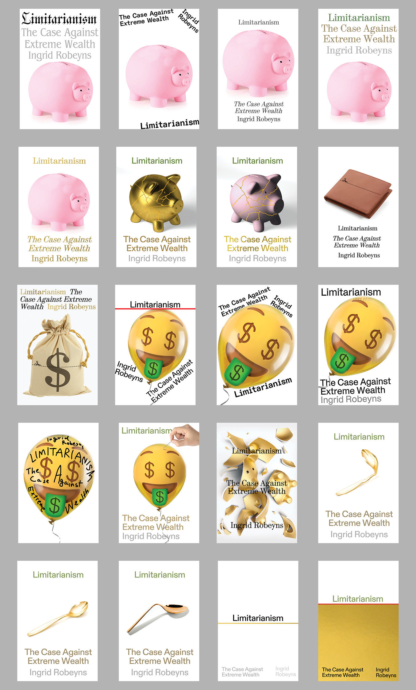
I also tried a few things to convey the idea of total overkill, like a champagne glass overflowing, but it all looked like a bad crime cover, and then I played around with the dots above every letter “i” (below). I did a stretched out piggy bank, too (which I won’t show), but for some reason it looked like an emaciated pig rather than a bloated one. (I should’ve got you to do it.) Did you have some other non-pig ideas?
I think a good book cover can be lots of things, but I like the idea that a cover should look like the author finished the book and (being as good at design as they are at writing) designed the cover too, to produce one complete object. I also like the idea that rather than a cover being purely something to grab your attention in a bookshop, you can refer to it as you’re reading and it starts to make a bit more sense and be part of the overall experience. What do you think makes a good book cover?
PD: That ceramic professor story is perfect. I used to teach a class over at the School of Visual Arts, it was a portfolio class so there was always the looming assumption that whatever they did had to be a portfolio piece. It was incredibly hard to get the students out of that mindset and to just immerse themselves in the process. I could have definitely used that story then!
For this cover I did also have a bunch of other ideas. There were a lot of piggy banks, though: one that was a gold piggy bank shattered, a kintsugi repaired piggy bank. I also had one of this emoji 🤑blown up as a balloon with text written all over it with a marker, some more straightforward type-only covers, a gold spoon bent or broken … I often try and make something that is funny, I don’t think they ever make anyone laugh really, but it’s like finding a small joke for myself through the process.
For the piggy bank cover that we decided to go with, I asked Danielle Del Plato, who is a great digital illustrator, to work with me on the final image. I love collaborating when possible.
One of the things that made no sense to me when I was working at Penguin Random House is that the interior design department and the book cover department were on the same floor but would rarely or never coordinate on the designs—to nobody’s fault, it was just structural, the way it was for a huge publisher to churn out books. Collaborating probably created unnecessary friction. It really didn’t reinforce the idea of creating something that felt, like you said, a complete object.
For me what makes for a good book cover is probably very similar to the way you put it. When the book feels whole and confident as an object, it speaks for itself, you can just tell by how it feels to hold it.
Anything that feels like it’s trying to sell me something or tell me how cool the book is becomes instant garbage in my mind.
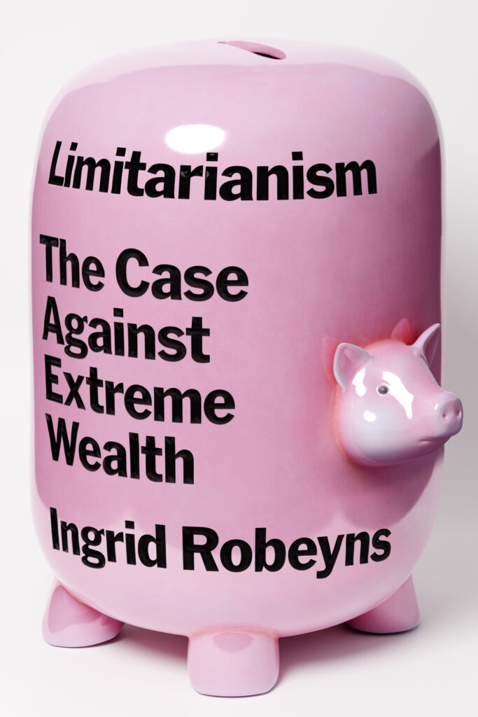 US cover for Limitarianism by Pablo Delcan.
I like how the calculator image looks for the cover, I think it’s similar to that thing I was saying before where there is that small joke that probably made you laugh or smile while making it. I think that’s great. Or maybe you didn’t find it funny and it’s just me projecting into your process. I find that when you’re having fun or when you’re invested in the work, that energy sometimes comes through in the finished piece. There is also something I love about those type-only cover sketches you shared with me, with the growing dots on them. I think a great book cover can be as simple as that, just letting the words do most of the work and stepping back.
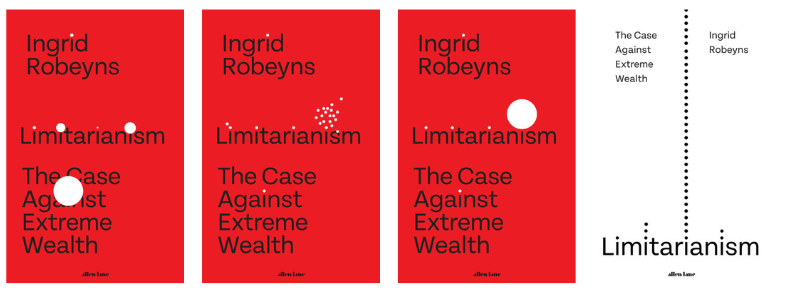
 UK cover design by Jamie Keenan.
I was looking through your website and I realized that you have your book covers divided up into British fiction/nonfiction and American fiction/nonfiction. I’ve done some work for publishers in Spain and Argentina besides the US, but haven’t done much work for publishers in the UK. In your experience, what are the biggest differences between the two? Are the process or the expectations from the publishers different in any way?
JK: I had a loony tutor on my Foundation course (a year-long course that art students in the UK used to have to complete before they could do a degree and where you got to try out a bit of fine art, graphic design, fashion design, and product design to see what you most enjoy) and he reckoned that putting our drawings or paintings up on a wall next to each other was the easy way out. He’d stick the ones he liked best next to this lovely, old fire extinguisher in the hallway and if they could live with that, he felt you might have created something half decent.
I have to remind myself sometimes, that book covers aren’t flat jpegs.I think that’s where I started thinking that really good graphic design (despite being two-dimensional) should somehow aim to be an object or take on a life of its own. I think most of my favorite books covers, the ones that I wish I’d done, manage to make that jump from being something nice, printed on paper, to a “thing,” and it’s interesting that you said “you can just tell by how it feels to hold it” rather than “look at it.” I have to remind myself sometimes, that book covers aren’t flat jpegs.
What you said about large publishing houses is something I’ve felt for a while. Rather than having separate departments that all feel like they’re in competition, I’ve got this (probably incredibly naive) idea that it’d be great to work in a group of four or five people (one editor, one marketing person, one designer, etc.) who would work on each book together and sit in the same part of the office, with their roles blurring into each other slightly and encouraging the idea that they are all working on making each book as good as possible, without any sense of competition or friction. Maybe being freelance and working with smaller publishers (or self-publishing authors directly) is a version of that? How much of your work is for large publishers compared to smaller companies and what difference, if any, does that make?
You’re completely right in guessing that I try to add a bit of humor to a lot of my covers—even if it’s not the laugh-out-loud kind. To me the calculator is meant to look slightly funny or odd, until you start reading the book and realize that even someone earning $100,000 a year would have to work for 10,000 years to become a billionaire and Elon Musk is worth about $246 billion, and the humor turns a bit darker. I agree with you completely that work someone has had fun putting together tends to convey that and similarly something that’s been fretted over or overworked does the opposite.
Talking of which, you do some amazing work for The New York Times and it always looks like you’ve not only enjoyed it, but that it’s come together effortlessly. But then I think that’s a sign of someone who’s really good at their job—it always makes you think, “I could easily do that,” and then you try plastering and realize it might not be true. How does your editorial work influence your book cover work and vice versa?
As for the difference between US and UK publishers, the process is identical, but I’ve always thought that US book covers are slightly more polarized. There are some properly horrible covers that you see in supermarkets that make you feel sick and some amazing work you see in Barnes & Noble that makes you feel sick (but with jealousy). There are plenty of amazing UK book covers too, but you have 330 million people to sell books to and we only have 67, so maybe UK publishers are slightly more conservative when it comes to cover design. From what you’ve seen of UK book covers, what differences do you see?
PD: That ideal setup of editors and designers working together to design books—that’s how I think really good magazines are set up to work right now. There are a handful of magazines I love working with for that particular reason. The goal of creating something in a collaborative way that spans the art department and the editorial team feels aligned.
I tried to quit the editorial work I was doing a couple of years ago. I think I burnt out and I wasn’t enjoying it as much anymore. I had done hundreds of these small and quick editorial art projects for newspapers and magazines over the past eight or so years.
But to your question about informing the book cover work: it absolutely has. I was once speaking with one of the past art directors for the New York Times op-ed page and he described these kinds of assignments with a resemblance to performance art. You’re given this time constraint, often a couple of hours, and a piece of writing, and whatever you do during that time is the thing itself. No time for overthinking or over-analyzing, it is what it is. And I think that’s something that I’ve brought, not just into book cover design but into everything I make. Just keeping things loose, interesting and immersed in the process. I’ve since come back to doing editorial work again, but much less than I used to.
With smaller publishers I find the books more interesting, and the process of designing the covers is more rewarding with less pressure.You’ve done such a crazy amount of book covers, and they’re so fucking good in so many different ways. Do you ever feel like, okay, that’s enough already? There is a point where it doesn’t feel the same way to make these as it did when you were just starting. How do you keep yourself engaged making all these great book covers over the years? Asking for a friend.
As far as working with big or small publishers, I work with smaller publishers more. I’ve definitely collected a fair share of kill fees from bigger publishers. I don’t love kill fees. With smaller publishers I find the books more interesting, and the process of designing the covers is more rewarding with less pressure, and there is that alignment we’ve been talking about. What’s your experience with big or small publishers?
I get to see all the great covers coming out of the UK by following you and some of your colleagues over there, but I’ve actually never been there. When I finally get to go there I’ll make sure to report back on your question!
JK: I love that editorial style of working, where you have a certain amount of time and whatever you’ve come up with is the final thing. When it comes to book covers, I sometimes feel like there are some people who will never accept anything from the first set of roughs you send in or that the process has to be slightly tortuous before you can even get close to having work accepted, because good work can only come from it going through a process of extreme refinement—like you’re on a pilgrimage or something. Funnily enough, the cover for Limitarianism went through the first time around—Jim Stoddart, the art director at Penguin Press, is really great to work for.
I have done a few covers over the years (I reckon it must be a few thousand) but what I find really amazing is that despite always working to pretty much the same format, with just those same four or five elements (author, title, subtitle, quote and maybe an image) there are still new things to do. I’m as enthusiastic about it now as I’ve ever been and I still think book cover design is the greatest job in the world.
I’ve got a folder on my mac called “nice pics” and any image I see that I like the look of or idea I try out that I think is any good, but that gets rejected, goes in the folder. I saw something squashed on the street this morning and it made me think it could work on a book cover, so I’ll wait until the right book comes along. I imagine every book cover designer has some kind of list of ideas they want to try out (right?) and it’s great when you finally get a chance (sometimes years later) to make it happen. That list keeps me interested.
I do try to get my hands dirty with paint or bits of paper and glue as often as possible, too, and maybe being freelance and working for lots of different kinds of publishing houses, producing different kinds of books, helps me stay enthusiastic. Like everyone else, I have days when I can’t get anything accepted and feel a bit sorry for myself, but then I see someone stacking shelves in the supermarket and I remember I’ve got it pretty easy.
You don’t strike me as someone who has a problem engaging with their work. It always looks like you’ve really attacked it, which is why it’s always so witty and perfectly executed. That kind of work can’t happen if you’re just going through the motions! So how do you retain your enthusiasm?
PD: I really admire what you mentioned about seeing all the potential within the constraints of a book cover. I think that love for what you do is evident in the remarkable range of your covers.
As far as for me retaining my enthusiasm and engagement with the work: it’s almost become the opposite of what it was when I started. I’ve learned to see it and to play it as a game; I don’t feel there is anything all that serious about it. It’s just fun.
I’d love to continue this conversation in person some time at a bar or café. If you’re ever in New York it’d be great to see you!
Thanks for all the thoughtful questions—I’m thrilled to have done this with you and in all honesty I really, really love your work.
JK: I’m a massive fan of your work too, Pablo, you know that—and I’m so glad we happen to have designed a cover for the particular book and were thrown together.
I think we’ve both been through the stage of realizing that style is temporary, but ideas (hopefully) last a bit longer and are more fun to come up with.
And I think, ultimately, that your ethos of treating the whole thing as a bit of a game or fun, is exactly the right way to view it. Whatever mistakes we make, we’re not surgeons, so nobody dies.
I’d love to continue the conversation too. Come over to London and I’ll introduce you to the UK book cover mafia. And I’ll do my best to get to New York. Keep up the great work.
___________________________
Limitarianism: The Case Against Extreme Wealth by Ingrid Robeyns will be published in the United States by Astra House on February 6, 2024, and in the United Kingdom by Allen Lane on February 1, 2024.